Tuesday, May 5, 2015

Google Forms


In this blog I will give an overview of Google Forms. A few years ago I was desperately looking for something like this and explored various options, all which charged a monthly subscription. The idea behind the forms is simple, you can either link to a form, send it in an email or embed it on your site.

If the form is for my own (or the team's) use I tend to use the link to open a form as a webpage on my mobile, and then save that link to my home screen. Thereafter I (or the team) can easily access the form to enter data. This is then appended to a Google Sheet and can be analysed, edited, etc.


Here is what Google say about Forms:

"Collect RSVPs, run a survey, or quickly create a team roster with a simple online form. Then check out the results, neatly organized in a spreadsheet. 

Get answers to your questions
Create simple or in-depth online surveys. Share them from a link, embed them on your website, or even right inside an email.

Sit back and watch the results come in
All responses to your questions are neatly organized in a spreadsheet, so sorting and analyzing data is a snap.

Access anywhere, anytime
All your form data is automatically organized in Google Sheets and stored in Google Drive. Access them wherever you go, from any device."


Oh, and they are really easy to set up :)

So lets get started.. In this tutorial I am going to set up a very simple survey form, say for an oil company, that is surveying well heads. I will limit the inputs. Using this idea, you could easily make your own survey forms for an environmental agency, estate agent or meter reading for a utility company. This tutorial assumes that you have a google account.


  • Log in to your Google Drive, click on My Drive and select Google Forms from the options displayed.


  • You will now be presented with the following page.


  • Enter the name of the form and the select the question type. I called this form Well Head Survey. The first question was changed to Scale 1 - 5, to describe the state of the well head 1 being very bad and 5 being very good.


  • If you want to add further questions, click on the Add Item button otherwise press Done. I added 3 other questions. Even after pressing Done, you still have the option to add further questions, and the form can always be edited at a later stage also.


  • You also have a few options, which I will not use in this tutorial. They are shown below.


  • You are now ready to send the form. I will show the both result here..


  • As I mentioned, I tend to send the link to my mobile, open it in a browser and then add to home screen so I can easily open the form and submit data quickly. So this is what it looks like on my mobile.. Note that I have taken 2 screenshots and placed them side by side, but hopefully you will get the idea of it being 1 long page. Give Google their dues, it is well presented.


  • Now, I copied the link to create the above, but you can share it as shown below and even create a form to be embedded in your own website.. Now I will enter an email address and show you how it arrives.


  • So here is what it looks like in a Gmail account. Note that if you email application cannot open the form correctly it will offer a link to a webpage to complet the form.


  • That's it, form complete.. You will find the completed data in your Google Drive. 
As always, the best why to learn it is to play about with it and try different things, so enjoy :)


Notes:

  • Never send passwords in Google Forms, or other sensitive information.
  • You will need a data connection to send the form.
  • I personally think it would be good if Google allowed images, or links to them. Then it would be almost perfect. I am sure Google have thought of this and it will happen soon..


Thanks for reading...


Monday, May 4, 2015

IF (was IFTTT) - Put the internet to work for you. Send a Tweet when you publish a Blog.


Check out IF (which was previously known as IFTTTIF This Then That), the url is: https://ifttt.com.


IF is a web based service that operates on triggers that you set, each web service is called a channel and can be triggered or actioned.  

As basic example and one which I will use here to try and explain how useful IF is.

What we will want to happen is for IF to watch my Blogger account for any new posts. When a new blog is posted it will trigger the action of sending a tweet from my Twitter account about the new blog. All automatically. 

I will aim to show you how to set this up in this blog…

All very useful, but that is just the tip of the iceberg, you can have IF monitor all sorts of accounts and carry out an action when a change is detected such as Gmail, Instagram, ebay, etc and even follow your favourite sports teams on ESPN and be alerted, Tweet or log the scores. Although as a supporter of Newcastle United, I defo do not Tweet our scores of late L

So when you set IF to watch for a change and then carry out an action when it is triggered, this is called a recipe, just like cooking.

When you create a recipe, you can publish it, so others can use it with their accounts. This has created a great platform for anyone just starting out with IF, pretty much anything you want to do is already there and free to use or tweak for your own needs.
In fact, if you type "Blogger Twitter" into the search box, it will return many recipes already created which will do this. But if you are more curious and want to see how it works, read on..
IF have created Collections of recipes for ease of use. Some of these Collections include designed for iOS, designed for Android, the online shopper, small business owner and even for the beach goer and nature lovers, to name but a few.

Best to check https://ifttt.com for more details and play about with it..


So, back to the tutorial and what we want to show here is how to automate a Tweet when this Blogger post is published. You will need IF, Twitter and a Blogger accounts.

By now I hope you have already set up an IF account and had a good play about with and maybe even created your recipes, and got hooked on the simplicity and usefulness of IF.

You will need an IF account to follow along, so if not already set up, go to https://ifttt.com  and register.

Now that you are registered with IF, and hopefully already have Blogger and Twitter accounts, let’s get started…


  • Click on My Recipes as highlighted above. This page will list all the recipes that you have created or added to your IF account. You can turn the recipes on and off here (back to supporting Newcastle United, I have turn all relevant recipes off until next session L ). You can also edit your recipes here and create new ones, which we will do here.

  • Now click on the Create a Recipe button.


  • You are now presented with the following screen, click on the word - This.


  • Which in a rather cool way displays the following:


  • The more eagle eyed among you will notice the top of the Blogger icon on the third row, second from the left.
  • Recap - What we want to happen is for IF to watch my Blogger account for any new posts. When a new blog is posted it will trigger the action of sending a tweet from my Twitter account about the new blog. All automatically.
  • Blogger is the Trigger Channel, therefore we will either scroll down to the Blogger icon or search for Blogger and then click on the Blogger icon.
  • As a point to note, this is a good place to browse to see what services are supported by IF.
  • After clicking on the Blogger icon, you will be presented with all the various options to set the trigger. There are only options with blogger which are shown below.


  • For the purposes of this demo, we will chose Any new post by clicking on it. The other option of new post labelled is useful if you only want to tweet about certain posts, not all of them.
  • If you are happy with your selection to proceed. 


  • So basically that is the trigger set, now we have to decide what we want to do when IF is triggered. Again, for this tutorial we will have IF send a Tweet informing that the new blog has been posted.
  • So now click on the word “that”


  • Again in a rather cool way your options will be displayed. I started to search for Twitter and the result was returned after a few letters.


  • Now, simply click on the Twitter icon to set as your action channel. You are now presented with the action options for the Twitter channel.
  • So let’s select Post a tweet with image as the action we want IF to complete.


  • Great, almost done. You are now offered the opportunity to add your own text to the Tweet, but you don’t have to add..
  • Note that IF has automatically inserted the Post Title and the Post Image url, do not overwrite as this are dynamic and created each time the IF runs this recipe.

  • Now click on the Create Action button.


  • You have now told IF what channel to watch for changes and if triggered then carry out an action. All you have to do now is change the title is you want and decide whether to be notified when the recipe is triggered. For the purposes of this, the notifications will be useful, as mentioned I have either turned off the recipes or the notifications of Newcastle United results, maybe be able to turn them on again next year when we start to play better J
  • Now just click on the Create Recipe button and you’re done.


  • The recipe will now show in My Recipes section and can be edited if required.
  • So that’s it, when I post this blog, IF should send a Tweet from my chosen account that I have just posted a new blog. All automatically and pretty cool J
Now, get stuck into IF, have a good play about & Put the internet to work for you 

Thanks for reading...


Thursday, November 6, 2014

Directional Text Within Cells

  
Directional Text Within Cells - Say for some reason you wish to enter long names as column headers, this can cause for an unsightly worksheet. Okay, what we will do in this post is to have employee names along the top and days down the side.


So we can either have:


Or:


Which to be honest, neither is acceptable. So how do we fix this?
Easy, select the cells containing the long employee names and right click, select format, then alignment.


Now move the Orientation dial to say 75 degrees, or type 75 into the degrees box, and the text will be formatted as such:


The Orientation may also be set by clicking on Orientation in the home tab, under the alignment group.


Sparklines, Data Bars & Color Scales


In this post, I will show you a very simple and quick way to visually funk up your data in Excel.

Sparklines are mini charts placed in single cells, each representing a row of data in your selection. As described by Microsoft.

So first thing, we will create a new spreadsheet and populate it with random data. Let’s use a sales department’s data for an example, say over 12 months (January to December), with 20 sales teams…
See my post on Filling Cells Quickly – Fill Series, if you are not sure how this is done.
Once we have the Months in the cells B1 (Jan) to M1 (Dec) and the teams in cells A2 (Team 1) to A21 (Team 20), we can then populate the sales figures per month for each team. To speed things up here, I am going to use the RANDBETWEEN() function to populate the sales figures.

Obviously if you are doing this on a live spreadsheet with real data, don’t overwrite with this function! This is just to test and introduce you to the concept of the Sparklines, Data Bars & Color Scales.

A couple of basic points about the RANDBETWEEN() function.
·        As any function, start with the equal sign ( = )
·        As you start typing both the RAND & RANDBETWEEN() functions will be offered as autocomplete. To use this, either click on the RANDBETWEEN() & press Tab to insert the function, or double click on the function.
·        The first argument is the lowest possible values and the second argument is the highest possible value. The cell will hold a random value between these two arguments.
·        Every time any other cell in the worksheet is changed in value, the RANDBETWEEN() function kicks in and changes the value of that cell. Try it.
So to get round this, once all cells (B2 to M21) are randomly populated with sales figures, just copy the sales figures in (B2 to M21) and then right click to use the Paste Options and select Values. This will paste the values only to the cells (B2 to M21).

Okay, to move on let us start to populate the sales data as shown below. I am using =RANDBETWEEN(300,30000) to make the lowest possible figure £300 and the highest £30000.

Now copy the cell B2, then select from B2 to M21 and paste, this will create a full set of random sales figures.


Note, that if you click on any of these cells, they will show that they still hold the =RANDBETWEEN(300,30000) function. This means that every time you open the spreadsheet or make a change to any cell, all values will change. So let’s select from B2 to M21 again, copy again and this time right click to use the Paste Options and select Values. Now the cells will not randomly change their values..

Now we have a good sales dataset to work with, but let’s just set the cells to Currency.


Note, that in the Formula Bar the figure is shown only, not the =RANDBETWEEN(300,30000) function.

So, we have all this data, and in real terms it is not really that much. Let’s create a simple chart to graphically display the data. As seen below, this is not a useful chart at all, in fact, it is pretty much a mess.


Okay, let’s remove the chart and insert Sparklines in column N to reflect each team’s sales values.
To do this, click on the cell N2, select the insert tab and select the Sparkline you want, I will use Line.


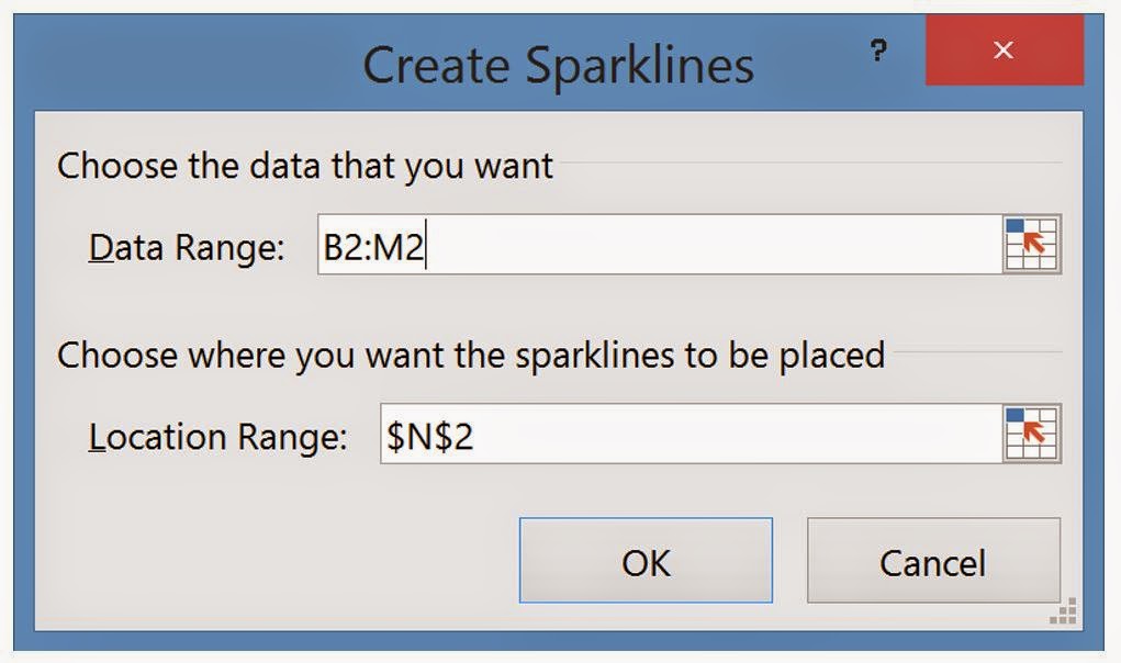
You will now be presented with an input box requesting your range, for the cell N2 we will use Team 1 sales data, which is in cells B2 to M2. Either type B2:M2 or select the cells to populate the Data Range.


Now left click on the bottom right of the cell N2 and drag to N21 to copy the Sparklines for all teams.


Now at a quick glance you can see how the teams have performed throughout the year. However, this is set to the individual team’s performance by default. Therefore if one team has only sold a maximum of £5000 in any month, and another has not dropped below £20000 per month the charts will max at the same level, because the chart is created with relevance to that row of data (team’s sales figures) alone.
To correct this we must select a Sparkleline, click on the design tab and select the Axis dropdown. Now set the minimum and maximum values to “Same for all Sparklines


To test this out, I am going to have Team 1 not drop below £20000 in any month and Team 2 not to get above £5000 in any month, the charts should be very noticeable, as can be seen below.


So what else can we do to make it easier to visualise the data? Let’s add Data Bars and see how that turns out..

To add Data Bars, select the sales figures in cells B2 to M21.
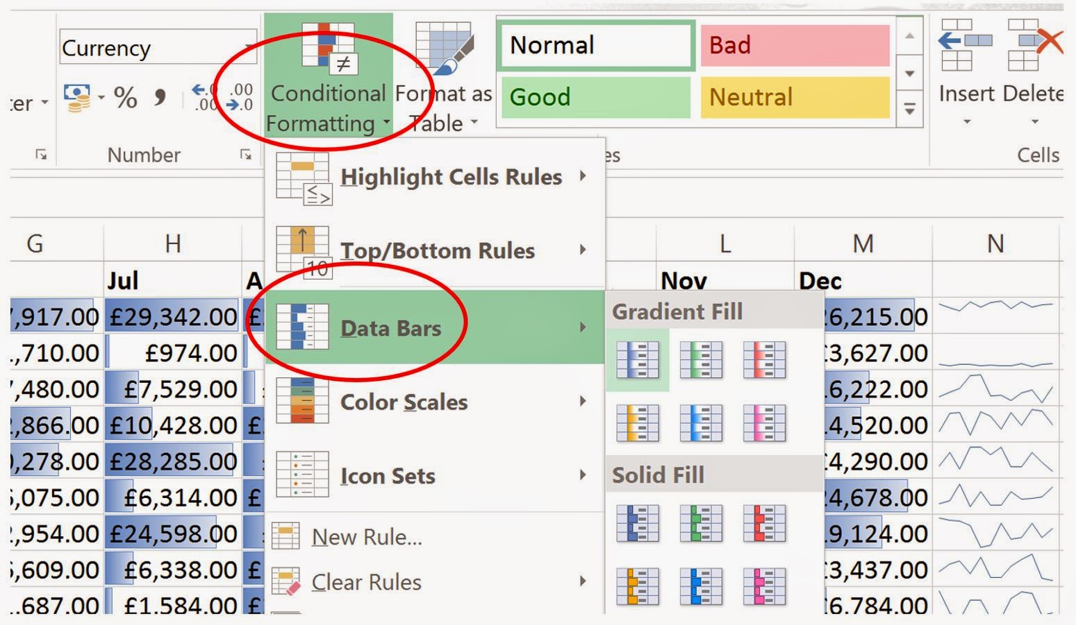
Now click on conditional formatting, and select Data Bars.
When you move your mouse over the type of fill, Excel will show you what that fill will look like, if selected. In the example below, I have chosen a Blue Gradient Fill. 


Now it is very easy to see which teams done well on a given month and which did not so well. The more blue shaded in a cell, the better the sales were for that team, the more white (or lack of blue), the less well that team preformed.


So let’s now add Color Scales..

First thing, we will clear the Data Bars formatting, by selecting the sales figures, then Conditional Formatting (within the Home Tab), Clear Rules, and Clear Rules from Selected Cells.


With the sales figures still selected (cells B2 to M21), click on Conditional Formatting (within the Home Tab), then Color Scales. Again, as you move your mouse over the options offered, Excel will display the resulting Color Scales on the dataset.


The above table is so much easier to pick out good and not so good performance, as a reminder, here is the raw sales figures we started with:


I think you will agree that the methods employed above do help when looking at the data.
You can create your own rules to format the data just the way you want. There are also lots of other options, like the top ten figures, when this is applied the 10 highest sales figures are displayed. These can be customised, so you can change how they are formatted and how many are selected, such as only the top 3 sales figures.

Again, as always the best way to learn and discover what can be achieved is to play about with the different options.

Just as a point to note, the Microsoft Snipping Tool is a great utility to capture screenshots. This has been around since 2002 and now ships with all versions of Windows. So if you wish to add the sales figures in a report, you can simply capture an area of the spreadsheet and paste into Word, or whichever application you are creating your report in.


Thanks for taking the time to read this, I hope it was of use and I hope you enjoy discovering new ways to present your data.