In this post, I will show you a very simple and quick way to visually funk up your data in Excel.
Sparklines are mini charts placed in single cells, each representing a
row of data in your selection. As described by Microsoft.
So first thing, we will create a new spreadsheet and populate it with
random data. Let’s use a sales department’s data for an example, say over 12
months (January to December), with 20 sales teams…
Once we have the Months in the cells B1 (Jan) to M1 (Dec) and the teams
in cells A2 (Team 1) to A21 (Team 20), we can then populate the sales figures per month for each
team. To speed things up here, I am going to use the RANDBETWEEN() function to
populate the sales figures.
Obviously if you are
doing this on a live spreadsheet with real data, don’t overwrite with this
function! This is just to test and introduce you to the concept of the
Sparklines, Data Bars & Color Scales.
A couple of basic points about
the RANDBETWEEN() function.
·
As any function, start with the
equal sign ( = )
·
As you start typing both the RAND
& RANDBETWEEN() functions will be offered as autocomplete. To use this,
either click on the RANDBETWEEN() & press Tab to insert the function, or
double click on the function.
·
The first argument is the lowest
possible values and the second argument is the highest possible value. The cell
will hold a random value between these two arguments.
·
Every time any other cell in the
worksheet is changed in value, the RANDBETWEEN() function kicks in and changes
the value of that cell. Try it.
So to get round this, once all cells (B2 to M21) are
randomly populated with sales figures, just copy the sales figures in (B2 to M21) and then
right click to use the Paste Options and select Values. This will paste the
values only to the cells (B2 to M21).
Okay, to move on let us start to populate the sales data as shown below.
I am using =RANDBETWEEN(300,30000) to make the lowest possible figure £300 and
the highest £30000.
Now copy the cell B2, then select from B2 to M21 and paste, this will create a full set of random sales figures.
Note, that if you click on any of these cells, they will show that they still hold the =RANDBETWEEN(300,30000)
function. This means that every time you open the spreadsheet or make a change
to any cell, all values will change. So let’s select from B2 to M21 again, copy again
and this time right click to use the Paste Options and select
Values. Now the cells will not randomly change their values..
Now we
have a good sales dataset to work with, but let’s just set the cells to
Currency.
Note,
that in the Formula Bar the figure is shown
only, not the =RANDBETWEEN(300,30000) function.
So, we have
all this data, and in real terms it is not really that much. Let’s create a
simple chart to graphically display the data. As seen below, this is not a
useful chart at all, in fact, it is pretty much a mess.
Okay,
let’s remove the chart and insert Sparklines in column N to reflect each team’s sales values.
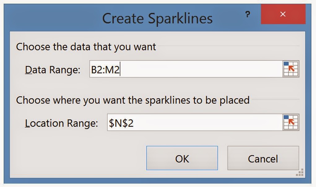
To do
this, click on the cell N2, select the insert tab and select the
Sparkline you want, I will use Line.
You will now be presented with an input box requesting your
range, for the cell N2 we will use Team 1 sales data, which is in cells B2 to M2. Either type B2:M2 or select the cells to
populate the Data Range.
Now left click on the bottom right of the cell N2 and drag to N21 to copy the Sparklines for
all teams.
Now at a quick glance you can see how the teams have performed
throughout the year. However, this is set to the individual team’s performance by
default. Therefore if one team has only sold a maximum of £5000 in any month,
and another has not dropped below £20000 per month the charts will max at the
same level, because the chart is created with relevance to that row of data
(team’s sales figures) alone.
To correct this we must select a Sparkleline, click on the design tab and select the Axis dropdown. Now set the minimum and maximum values to “Same for all
Sparklines”
To test this out, I am going to have Team 1 not drop below £20000 in
any month and Team 2 not to get above £5000 in any month, the charts should be
very noticeable, as can be seen below.
So what else can we do to make it easier to visualise the data? Let’s
add Data Bars and see how that
turns out..
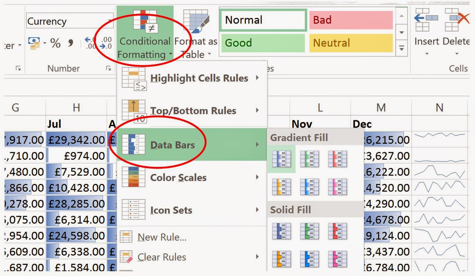
To add Data Bars, select the sales figures in cells B2 to M21.
Now click on conditional formatting, and select Data Bars.
When you move your mouse over the type of fill, Excel will show you what
that fill will look like, if selected. In the example below, I have chosen a
Blue Gradient Fill.
Now it is very easy to see which teams done well on a given month and
which did not so well. The more blue shaded in a cell, the better the sales
were for that team, the more white (or lack of blue), the less well that team
preformed.
So let’s now add Color Scales..
First thing, we will clear the Data Bars formatting, by selecting the sales figures,
then Conditional Formatting (within the Home Tab), Clear Rules, and Clear Rules from
Selected Cells.
With the sales figures still selected (cells B2 to M21), click on Conditional
Formatting (within the Home Tab), then Color Scales. Again, as you move your mouse over the options
offered, Excel will display the resulting Color Scales on the dataset.
The above table is so much easier to pick out good and not so good
performance, as a reminder, here is the raw sales figures we started with:
I think you will agree that the methods employed above do help when
looking at the data.
You can create your own rules to format the data just the way you want.
There are also lots of other options, like the top ten figures, when this is
applied the 10 highest sales figures are displayed. These can be customised, so
you can change how they are formatted and how many are selected, such as only
the top 3 sales figures.
Again, as always the best way to learn and discover what can be achieved
is to play about with the different options.
Just as a point to note, the Microsoft Snipping Tool is a great utility
to capture screenshots. This has been around since 2002 and now ships with all
versions of Windows. So if you wish to add the sales figures in a report, you
can simply capture an area of the spreadsheet and paste into Word, or whichever
application you are creating your report in.
Thanks for taking the time to read this, I hope it was of use and I hope
you enjoy discovering new ways to present your data.