Simple Burndown charts in Microsoft Excel

The primary idea of this blog is to introduce some basic idea of a Burndown Chart. Now, many people reading this will be familiar with various Project Management methodologies, including Agile & Burndown Charts already, so it's not really aimed at you, sorry. Anyway, take comfort in that there are many far better systems out there and you probably already use them.
However, if you are unfamiliar with the idea of Burndown Charts, the idea is to track the progress of a project (or phase, sprint or whatever you wish to call it, but a definable section of the project).
So in this blog, we will have a fictitious project that is planned to last 10 days. There will be 27 planned tasks to be completed during this time, to complete the project. To keep it simple for demonstration purposes, I we have broke the tasks into 3 tasks to be completed a day. This also gives a tolerance of an estimated day, which could bring the project in a day early. Always better to look better bringing the project in on time or early than overestimating and not completing on time. Again, this blog is aimed at people with limited exposure to Project Management and Burndown Charts.
Lets explain how this is done.
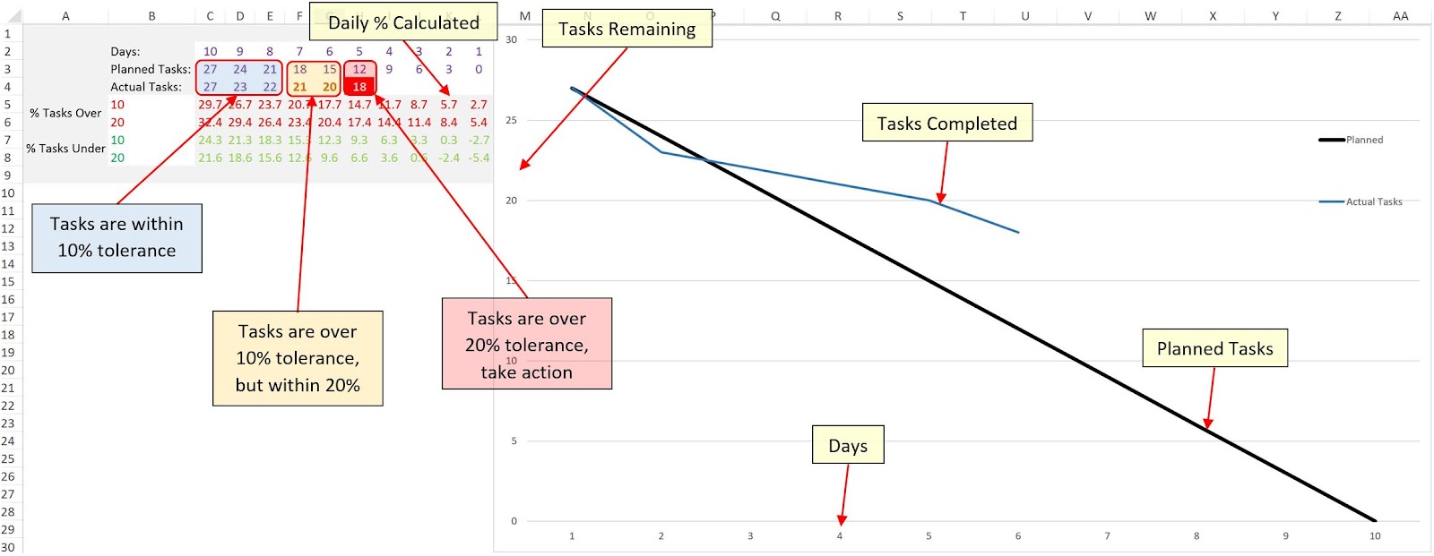
The table was created on the left:
- It has days running down from 10 to 1.
- The Planned Tasks are reduced by 3 each day, meaning that the plan is to complete 3 tasks per day.
- The Actual Tasks are logged. Showing the first 3 days are within plan. Note, that the 3rd day is one task over, this is not highlighted as we have set a 10% tolerance and one task is within this.
- However, the 4th and 5th days show the project starting to fall behind, they have broke the 10% tolerance and are highlighted.
- The 6th day has now broke the 20% tolerance and is more defined. Immediate action now needs to be taken to get the project back on track.
The graph is based on Days, Planned Tasks and Actual Tasks:
- This gives a visual representation of how the project is performing.
- you will notice that on day 3 the completed tasks break the projection to show potential issues.
This is all very simple and handy to keep an eye on a simple project, but let's have a look at a couple of other ideas showing the tolerance in the graph.

Here we have added the tolerance values to the graph. You can set your own tolerance and as long as the blue line (representing the state of project) remains within the tolerance line, then it's going well :)
I have also tolerance for the project being completed too quick, if this does happen then questions still have to be asked. Is the quality still attended, has it been misestimated, can resources be better used elsewhere?
The good thing about using this method is that if you are 20% under you can easily see that the project will be complete in 8 days.
However, an issue is that the tolerance remains the same throughout the life cycle of the project. It may be more useful to take into effect the fact of the time remaining. Meaning that with 2 days to go breaking the 20% tolerance may cause major issues and panic :)
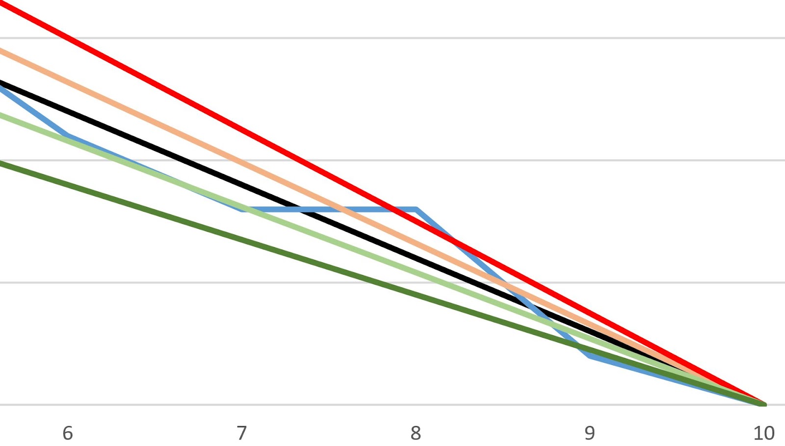
So the next image shows bringing the Burndown Chart to an end point, which in theory should focus on the completion date and adjust the tolerance lines accordingly.

Notice that the blue line (project) breaks the 20% tolerance on day 8, whereas this was not even highlighted in the previous example. The reason is that this method is taking into account the remaining days, which in this case is 2 days. It was planned that at this stage of the project there would be 6 tasks left to complete, and there are actually 8 tasks left and a very short time to complete them to bring the project in on time.
A zoomed in section of the graph:
So there you have it.. As mentioned, this is aimed at people with little exposure to projects or Burndown Charts / methodologies.
Most project management tools will offer inbuilt charts and projections, so have a look at some of them, but hopefully this has given you an insight of one way to keep an eye on how your project is performing.
If you want, you can download and play about and look at the formulas etc, with the spreadsheet from the side menu.
As always, thanks for reading & I hope you enjoy...
keep learning